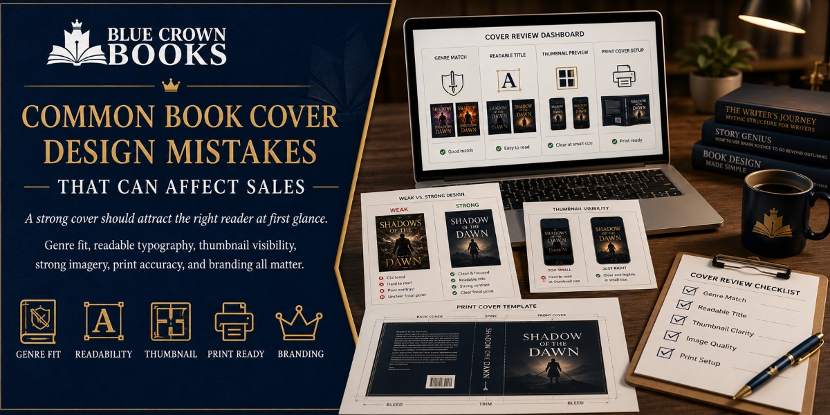
A book cover is often the first point of contact between a reader and a book. Before someone reads the description, checks the reviews, or opens the sample pages, the cover creates an immediate impression. A strong design can communicate genre, tone, quality, and audience in seconds. A weak design can cause readers to scroll past, even when the manuscript itself is excellent.
For authors preparing to publish, understanding common book cover design mistakes is essential. Blue Crown Books helps connect writing, editing, formatting, publishing, author branding, and book marketing so the cover supports the complete publishing strategy instead of functioning as a separate decoration.
Using a Design That Does Not Match the Genre
One of the most damaging book cover design mistakes is choosing imagery, colors, fonts, or layouts that do not match the book’s genre. Readers rely on familiar visual signals. A thriller may use bold contrast and tension-filled imagery, while a children’s book may require brighter colors, expressive illustrations, and age-appropriate typography.
When a cover sends the wrong message, it can attract the wrong audience while confusing the intended readers. Blue Crown Books considers the manuscript’s subject, reader expectations, marketplace category, and emotional tone. The goal is not to copy competing books but to create a professional cover that belongs within its genre.
Adding Too Much Text and Too Many Visual Elements
Some authors try to place every important idea from the book onto the cover. This can result in crowded imagery, multiple taglines, long subtitles, decorative symbols, and competing fonts. Instead of creating interest, the design becomes difficult to understand.
A book cover should communicate one clear visual idea. The title, subtitle, author name, and main image need a readable hierarchy. Additional information can be included in the book description, back-cover copy, author website, or promotional campaign.
Blue Crown Books supports these surrounding elements through book writing, editing, website content writing, blog writing, and book marketing, keeping the cover clear and focused.
Choosing Fonts That Are Difficult to Read
Typography can make a cover look professional or amateur. Thin lettering, overly decorative fonts, poor spacing, and weak color contrast can make the title difficult to read. A font may look attractive on a large computer screen but become unreadable when the book appears as a small online thumbnail.
The title should remain clear at different sizes, and the font should support the book’s genre and mood. Blue Crown Books considers readability, balance, font selection, and placement when developing book cover designs.
Ignoring Thumbnail Visibility
Many readers first encounter books on online retailers, social media posts, advertisements, or mobile devices. In these settings, covers appear much smaller than printed copies. A design that looks impressive at full size may lose its impact when reduced.
Authors should test the cover as a thumbnail before approving it. The title should remain visible, the main image should still make sense, and the composition should not become cluttered.
This is especially important for eBooks, where online browsing plays a major role in the purchasing journey. Blue Crown Books combines eBook formatting, publishing assistance, author branding, and promotional planning to help create a consistent presentation across different platforms.
Using Low-Quality or Generic Images
Low-resolution images can appear blurry or pixelated in print. Generic stock images can also make a book feel forgettable, especially when the same image has been used on unrelated titles.
A cover should look intentional and connected to the manuscript. Custom illustrations, careful image selection, professional photo treatment, and thoughtful composition can give a book a stronger identity.
This is particularly important for children’s books, fiction, nonfiction, autobiographies, business books, and genre-based projects where the visual should represent the content accurately. Blue Crown Books supports authors across these categories with writing, editing, design, and publishing services.
Forgetting Print Cover Requirements
A front cover is only one part of a printed book cover. The final file may also require a spine, back cover, bleed area, trim size, barcode space, and measurements based on the book’s page count and paper type.
A design created without these technical requirements may be rejected by a publishing platform or print incorrectly. Important text and images may also be cut off during production.
Cover design should be coordinated with book editing and formatting because the final page count can affect the spine width. Blue Crown Books connects book cover design with formatting, layout, self-publishing, and publishing assistance so each production stage supports the next.
Creating the Cover Before the Manuscript Is Ready
Designing too early can lead to unnecessary revisions. The title may change, the subtitle may need improvement, the page count may increase, or the book’s focus may become clearer during editing.
Authors may then have to redesign the cover or accept a concept that no longer represents the final manuscript. A more effective process begins with a clear publishing plan.
Ghostwriting, fiction writing, nonfiction writing, business book writing, children’s book writing, and autobiography writing should move into editing and proofreading before final design decisions are approved. Blue Crown Books helps organize these stages so the cover represents the finished book rather than an early draft.
Overlooking the Back Cover and Book Description
The front cover attracts attention, but the back cover and online book description help persuade the reader. Weak copy, spelling errors, long paragraphs, or unclear messaging can reduce trust.
The design and wording should work together to explain what the reader can expect. Professional editing, proofreading, book reviews, website content, blog writing, and marketing copy can strengthen the message surrounding the book.
Blue Crown Books helps authors build a complete presentation instead of relying on the front cover alone to generate interest and sales.
Failing to Build a Consistent Author Brand
A book cover should stand on its own, but it should also support the author’s wider identity. Inconsistent colors, typography, imagery, and messaging across a book series, website, social media pages, and promotional materials can make an author look less established.
Blue Crown Books can align book cover design with author branding, website content, publishing support, audiobook preparation, and book marketing. This consistency is especially valuable for authors planning multiple books or building a long-term publishing career.
Skipping Professional Feedback
Authors are emotionally connected to their work, which can make objective design decisions difficult. Personal preferences do not always match reader expectations or marketplace standards.
Feedback from experienced editors, designers, and publishing professionals can reveal problems before the book is released. It can identify readability issues, genre confusion, unsuitable imagery, technical errors, or inconsistencies in the author’s branding.
Blue Crown Books provides an integrated publishing approach that includes ghostwriting, editing and proofreading, formatting and layout, cover design, self-publishing support, publishing consultancy, audiobook services, author branding, and book marketing.
Final Thoughts
Common book cover design mistakes can affect a book’s visibility, credibility, and sales potential. Effective covers are clear, readable, genre-appropriate, technically accurate, and aligned with the overall publishing strategy.
Authors should avoid overcrowded layouts, weak typography, low-quality images, unclear branding, and designs that fail when displayed as thumbnails.
Blue Crown Books helps authors move from idea to publication with coordinated writing, editing, formatting, book cover design, publishing, and marketing support. When every stage works together, the cover becomes more than an attractive image. It becomes a valuable sales tool that introduces the book professionally and encourages readers to take the next step.